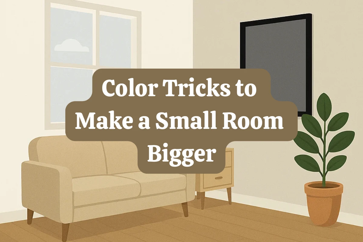
Designer-Approved Color Tricks to Make a Small Room Look Bigger
Small rooms aren’t doomed to feel cramped—you just need a little chromatic sleight of hand. Interior designers rely on a handful of clever color strategies that bounce light, blur visual boundaries, and even fake added height.
Below are the most effective, research-backed color techniques that can transform a tiny room into one that feels surprisingly open and inviting.
Contents
Start With the Science: Light Reflectance Value (LRV)
Before you even pick up a paint swatch, there’s one number every designer wants you to check: **Light Reflectance Value**, or **LRV**. It measures how much light a color reflects (vs. absorbs) on a scale from 0 (pure black) to 100 (pure white).
In small spaces where light is scarce, walls with high LRV act like extra light sources, reflecting sunlight and softening dark corners that make a room feel tighter.
“Knowing a shade’s LRV before you buy,” says color psychologist Tash Bradley, “lets you predict how airy—or cave-like—the room will feel.”
— Homes & Gardens
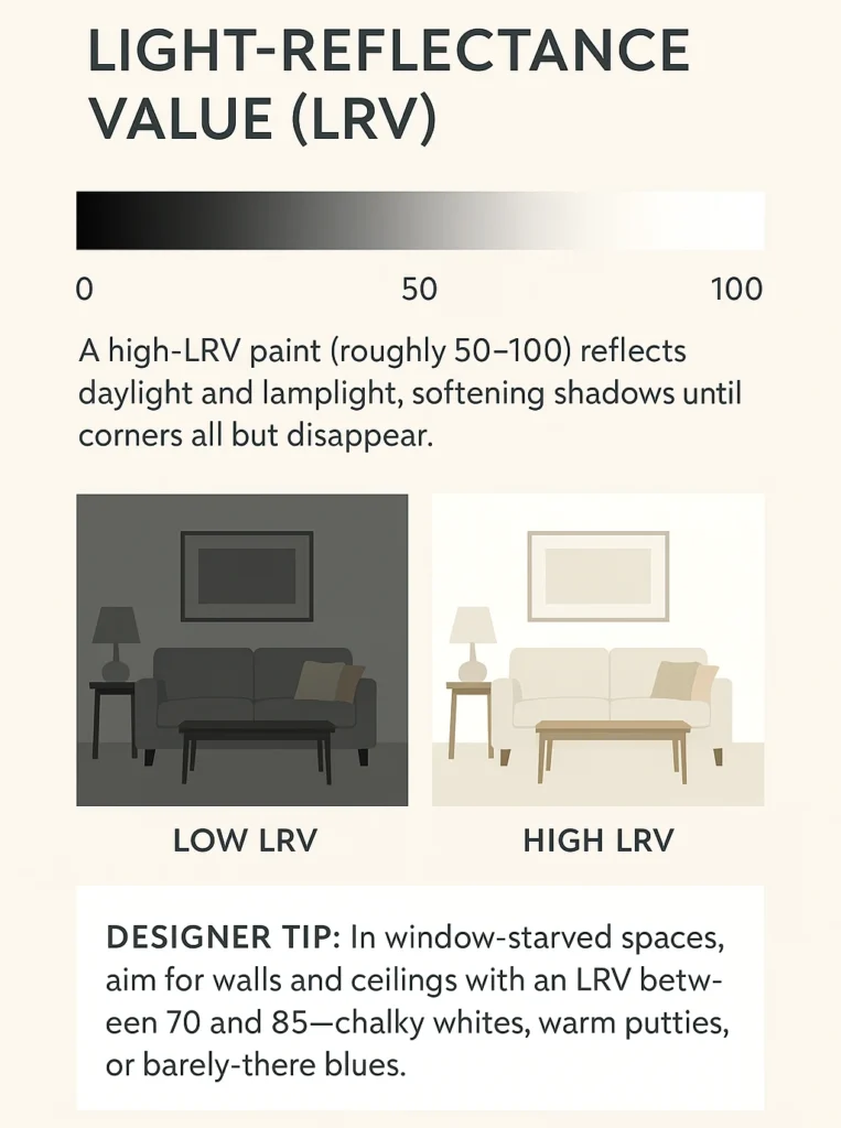
Why It Matters:
- LRV 70–85: These shades reflect light beautifully without looking sterile. Perfect for rooms with limited windows or awkward layouts.
- Go-to colors: Warm greiges, misty sky blues, soft putty, chalky whites.
- Avoid extremes: Super bright whites (LRV 90+) can feel stark in small rooms, while anything below 50 LRV will start to absorb too much light unless balanced carefully.
Pro Tip: Most major paint brands (like Sherwin-Williams, Benjamin Moore, and Farrow & Ball) list LRV on their websites or color cards. No LRV shown? Ask at the counter—paint reps usually have a full index.
Tone-on-Tone Drenching: Blur Every Edge
Want the room to feel bigger without a single mirror or window? Drench it.
Tone-on-tone drenching—painting the walls, trim, and ceiling in one continuous hue—is one of 2025’s most transformative small-space trends. By eliminating contrast, you erase lines that mark where one surface ends and another begins. The result is a seamless, flowing space that feels taller and calmer.
“It’s the biggest color move we’re seeing for compact spaces,”
— Homes & Gardens
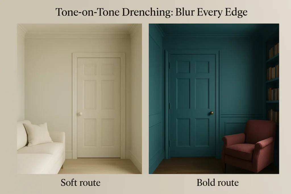
Choose Your Drenching Style:
- Soft + Serene:
Use light neutrals like creamy beige, misty sage, or sandy taupe. Matte walls + eggshell trim offer just enough contrast to reflect light subtly. - Bold + Cocooning:
Take a cue from designers like Avery Cox who embrace saturated shades like merlot, forest green, or marine blue. Drench everything—from walls to built-ins—for a rich, enveloping effect.
Why it works: With no abrupt edges or color breaks, your eye glides from surface to surface without pause, making the space feel larger and more unified.
Embrace the Dark Side—With Lighting Backup
It sounds counterintuitive, but dark colors can make small rooms feel bigger—if you pair them with the right lighting.
Deep hues absorb light instead of bouncing it, reducing glare and flattening shadows. That means fewer visible “edges,” more depth, and a mysterious boundary-blurring effect.
Real Simple calls this the “void effect,” noting that an all-black room can actually “trick the eye into believing there’s more space.”
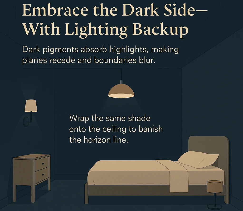
Where to Use It:
- Guest rooms: Inky blue, charcoal, or espresso makes the bed feel cozy, not boxed in.
- Home offices: Aubergine or blackened green create moody focus zones.
- TV rooms or dens: Dark walls reduce screen glare and boost ambiance.
Add Light Thoughtfully:
- Use warm-tone bulbs (2700K–3000K) to balance the coolness of dark tones.
- Layer lighting—table lamps, sconces, and under-cabinet LEDs—at different heights.
- Finish smart: Matte or eggshell paint helps diffuse light gently instead of reflecting it harshly.
Design tip: A single warm lamp against a navy wall can feel like a softly lit painting—cozy, sophisticated, and surprisingly expansive.
Raise (or Drop) the Ceiling With Paint
Paint can play optical tricks that visually alter ceiling height—no structural changes needed.
Two Designer-Favorite Techniques:
👆 Make Ceilings Feel Higher:
- Paint the top 12–18 inches of the wall the same color as the ceiling. This blurs the junction where the wall ends and ceiling begins, drawing the eye upward.
- Best colors: Pale ivory, soft white, or light sky blue.
👇 Lower Tall Ceilings for Intimacy:
- Paint the ceiling a darker color than the walls—like plum, navy, or smoky gray.
- Creates a cozier, more grounded vibe in rooms that feel too vertical or cavernous.
“Your eye doesn’t know where the wall stops—so it assumes the ceiling is higher,”
— Apartment Therapy
Why It Works:
- Blurs horizontal boundaries: Paint transitions soften corners and trick the brain into misreading dimensions.
- Directs attention: Dark ceilings pull the eye down; light ceilings push it up.
- Dissolves the frame: Get rid of that hard contrast line at the ceiling edge, and you remove the visual limit of the space.
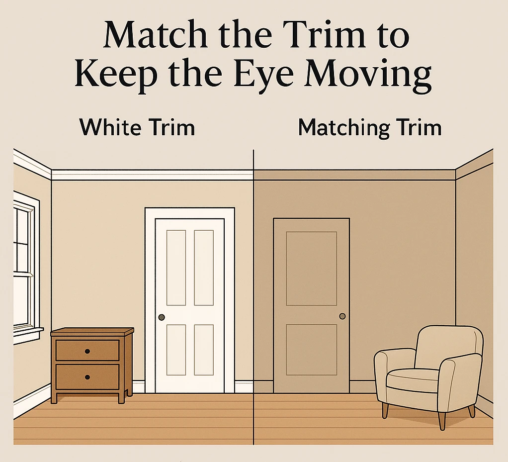
Match the Trim to Keep the Eye Moving
High-contrast white trim used to be a default, but in small rooms, it can chop up space and create visual clutter.
Instead, paint the trim the same color as the wall for a smooth, uninterrupted flow.
As Better Homes & Gardens notes, in tight quarters, white trim halts the gaze, carving up walls and visually shrinking the room.
How to Pull It Off:
- Use the same hue in a different finish (e.g. matte for walls, satin for trim).
- Don’t forget baseboards, window casings, and even doors.
Extra touch: If you have built-ins, painting them into the wall color makes them feel integrated—not bulky.
Finish & Furniture: The Supporting Cast
Paint isn’t the only player in the room—your finish choices and furnishings can amplify (or undo) all that color work.
Sheen Strategy:
- Matte: Best for pale drenched walls—softens the room and hides surface texture.
- Eggshell/Satin: Ideal for trim and accents—reflects light just enough to add depth without disrupting flow.
- Gloss (used sparingly): Adds drama to deep hues when applied to built-ins, ceiling medallions, or furniture.
Furniture That Blends or Balances:
- For light walls: Go for pieces just a shade or two darker—taupe couch, sandy wood dresser. Keeps things grounded without weighing the room down.
- For dark walls: Choose light or warm upholstery (think flax linen or creamy boucle) to pop against the rich background.
“Think of your furniture as a silhouette—it should echo the room’s rhythm, not fight it,”
— Real Homes
The Final Takeaway
Making a small room feel bigger isn’t about playing it safe with stark white walls. It’s about choosing colors that work with your room’s light, layout, and energy.
- Use high-LRV hues to reflect light and stretch space.
- Drench walls and trim in tone-on-tone color to erase boundaries.
- Go dark—strategically—with layered lighting to dissolve edges.
- Manipulate ceiling height with simple paint tricks.
- Match trim and finishes to keep the visual flow uninterrupted.
- Balance your furniture to blend, ground, or elevate the scheme.
With the right color strategy, even the smallest room can feel not just bigger—but better.